Operation Renovation: Kitchen
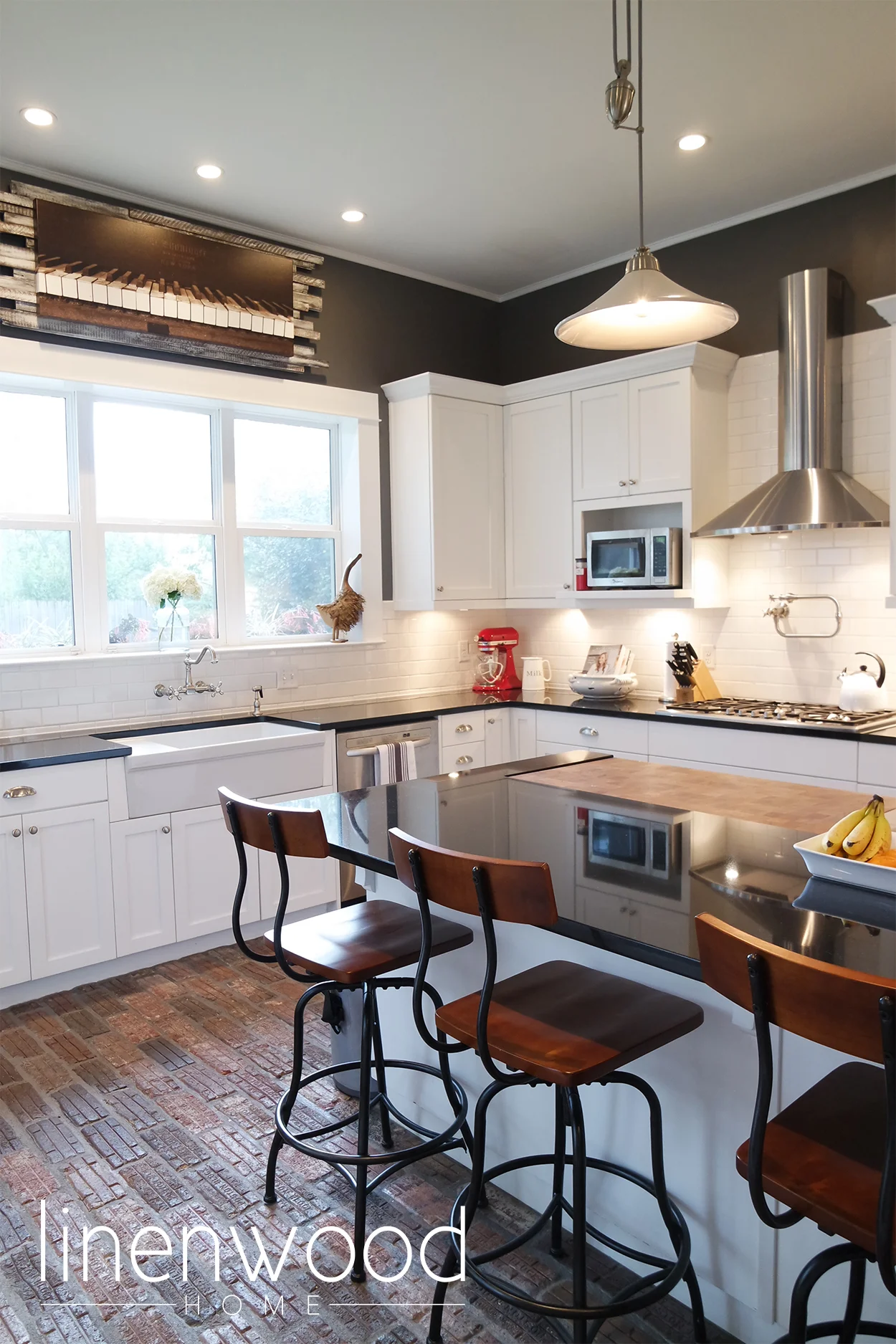
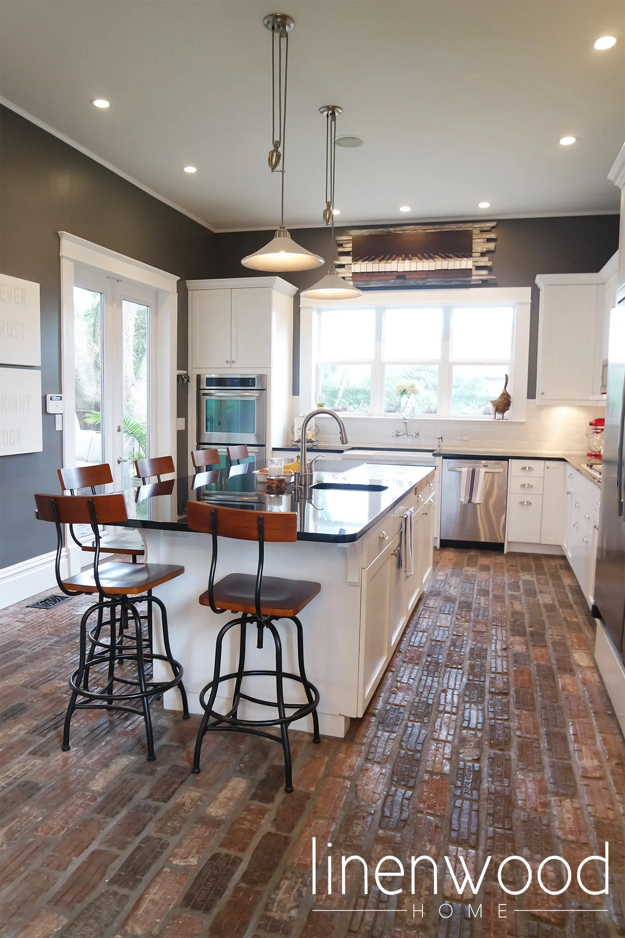
The best part of the Brainerd Street House renovation was being able to put in the kitchen I had always dreamed about. When we first got into the house, it was clear that the current kitchen space would not be large enough. Like most families, the kitchen is the hub of our home. We wanted ample space and seating for family and friends to be comfortable.
The back wall of the house actually separated from the house during Hurricane Ivan, so adding on the kitchen addition helped with structural issues as well. I had always wanted brick floors in my kitchen, so when our landscaper told us he had some actual antique road pavers from Indiana, we jumped on the opportunity to use them. They give the kitchen depth and provide great texture. No to mention, they are always a great conversation piece!
Here are some of the before pictures of our kitchen:
What is our kitchen style?
I knew I wanted a very traditional, white kitchen. I love subway tile and shaker style cabinets. I love bin pulls. We worked with a local custom cabinet maker in lieu of going to the big box stores, so that we would have complete custom fit cabinets.
I knew I wanted a HUGE island with seating for at least 6. We chose black granite, with the help of Superior Granite, to keep the kitchen grounded. {However, I am currently thinking about replacing the island granite with a white marble or quartzite.} A unique feature in the island is the large Boo's Block cutting board. We had purchased this cutting board for a small kitchen island in our previous home. We spent a lot of money on it, and were not ready to part with it! We chose to have it built in directly to our island to make cutting fruits and veggies more convenient. It is located directly above the trash so we can simply sweep cuttings into the garbage - maybe one of the best ideas during this reno!
The lighting is relatively simple - we installed {a lot of} can lights and I found two great pulley pendant lights from Pottery Barn. I liked that the pulley style of the lights kept with historical aspects of design.
I played around with all different colors in the kitchen. I ended up choosing a very dark grey because everything else is so white. I just love using dark wall colors when you can, and this was the perfect instance. {I'm dying to paint some room in our house black}
Lastly, we kept the artwork minimal in the kitchen, but I knew I wanted to fill the space above the three windows. I considered many different options, but was never able to pull the trigger. Last year, we finally found a beautiful photograph of piano keys at the Pensacola Arts Festival. No, neither my husband nor I, play the piano, but there was just something about this image that spoke to us. Once we got it home, I thought it didn't look quite finished with just the canvas on the wall. So, I recruited my favorite handyman {the hubby} and we built a wooden backdrop. We used leftover floor slats we saved from the second floor of the house. It was a little dark, so I applied some paint to lighten up the wood. I think it turned out beautifully and it fits the space and the neutralness of our kitchen, while adding a bit of fun dramatics.
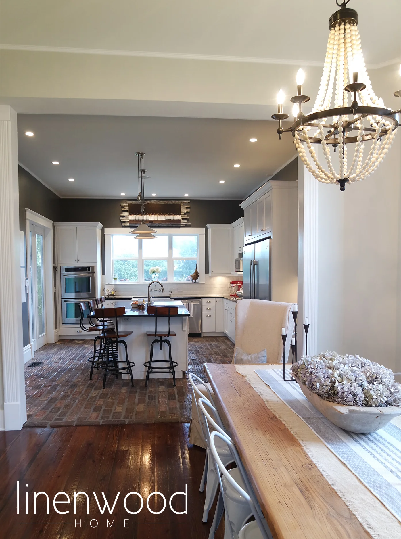
The kitchen opens up to the dining room, which I think is perfect for entertaining. We have ample seating and space to serve our guests.
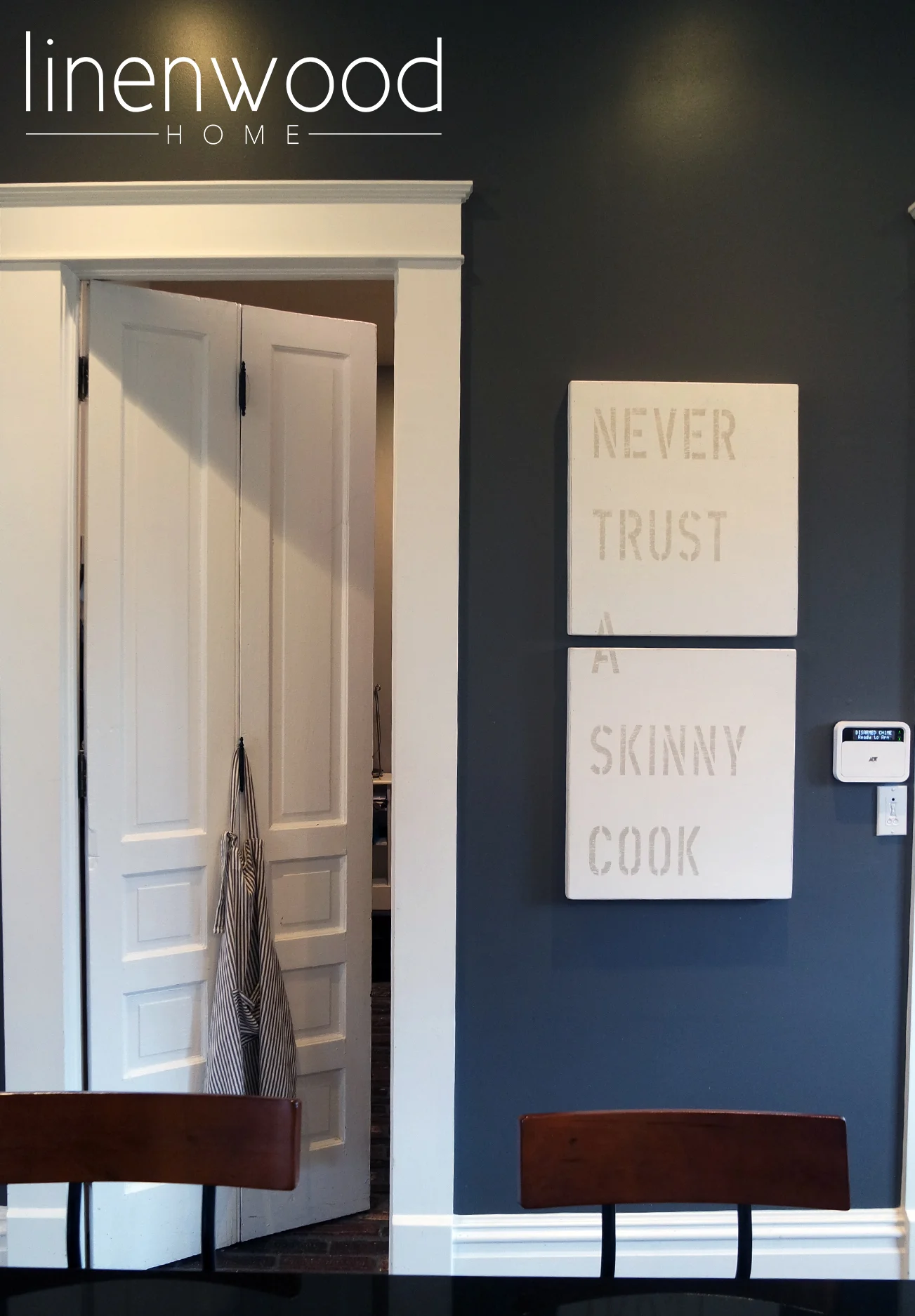
And just for fun, I had to include one of my favorite pieces of art in the house. I found this gem at my absolute favorite local garden and home store, Duh.
Cook something good this weekend - I hope you have a great one!!


