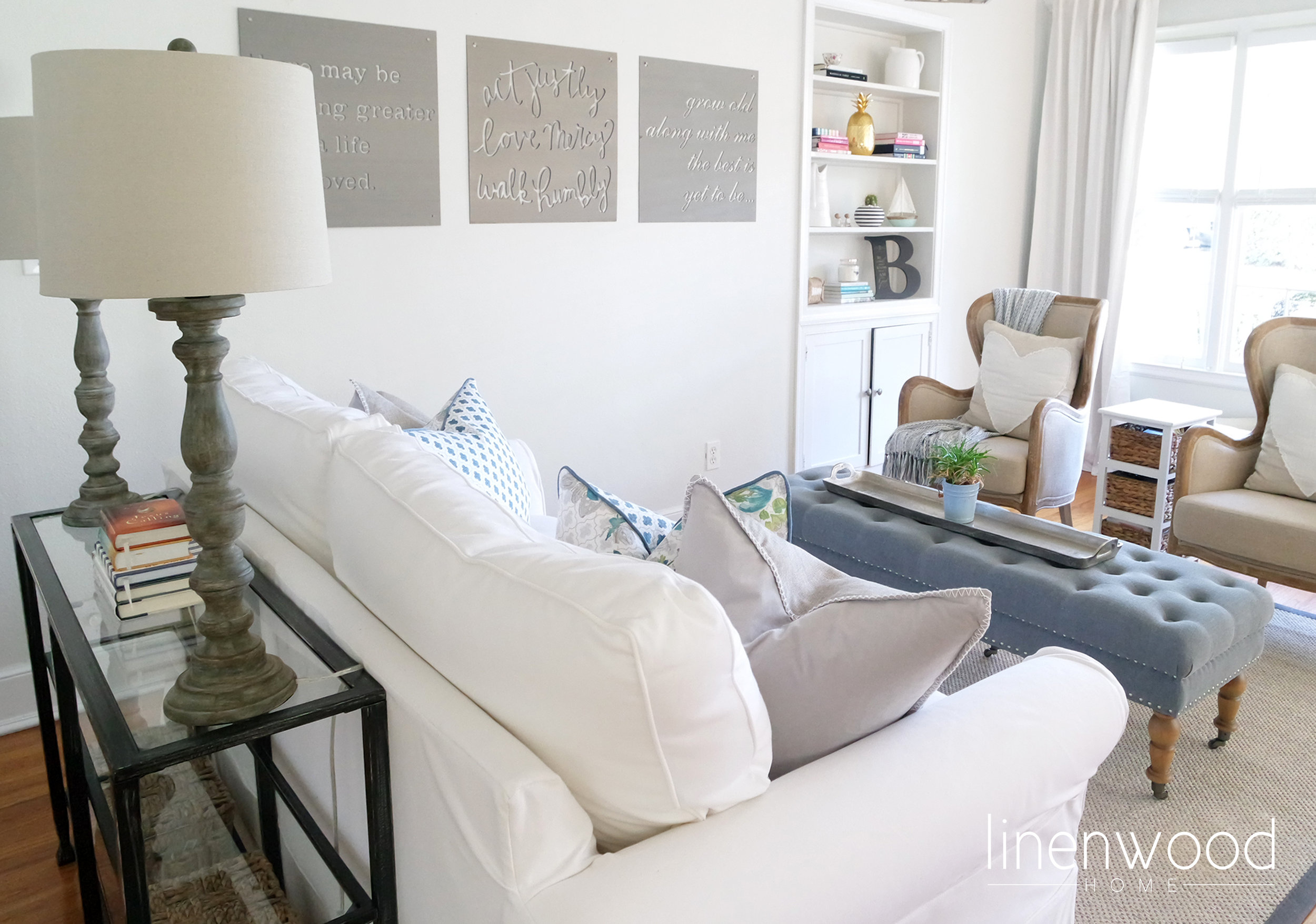
{Lloyd St. Bungalow} Living Room
I have been so lucky in this design career I started two years ago. I have been blessed with some great clients, which I know can be a rarity. But you know there are times when certain clients stand out in your memories as being super amazing! Well, these clients, this sweet little family of four, have been those incredibly wonderful clients.
It all started when the husband reached out to me because he wanted to surprise his wife with a design consult for Mother's Day - what a great gift, right? From the beginning, they were very easy to talk to and I always felt like I was going to a friend's house. The best part is they love my style and they let me have full reign over the project. Sure, I ran fabric choices and furniture styles by them, but for the most part they trusted me and my vision.
Like most young couples, you get a lot of hand me down furnishings when you buy your first home. Then there comes a point when it's just time for a new look, one that fully represents your style. That was the case at the {Lloyd St. Bungalow} project. The first room we tackled was the living room. This is the room that you walk into, so we wanted to make it a little more polished and just plain pretty. But it also had to be comfortable for family and friends.
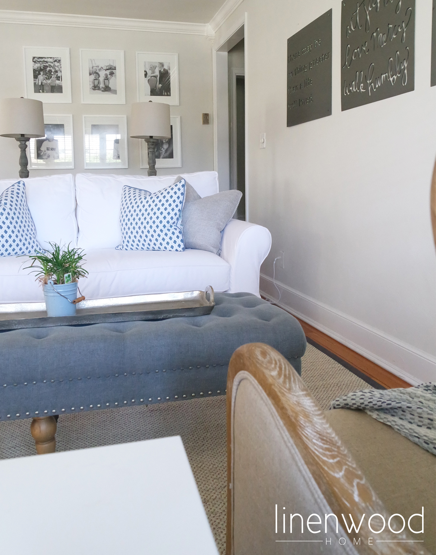
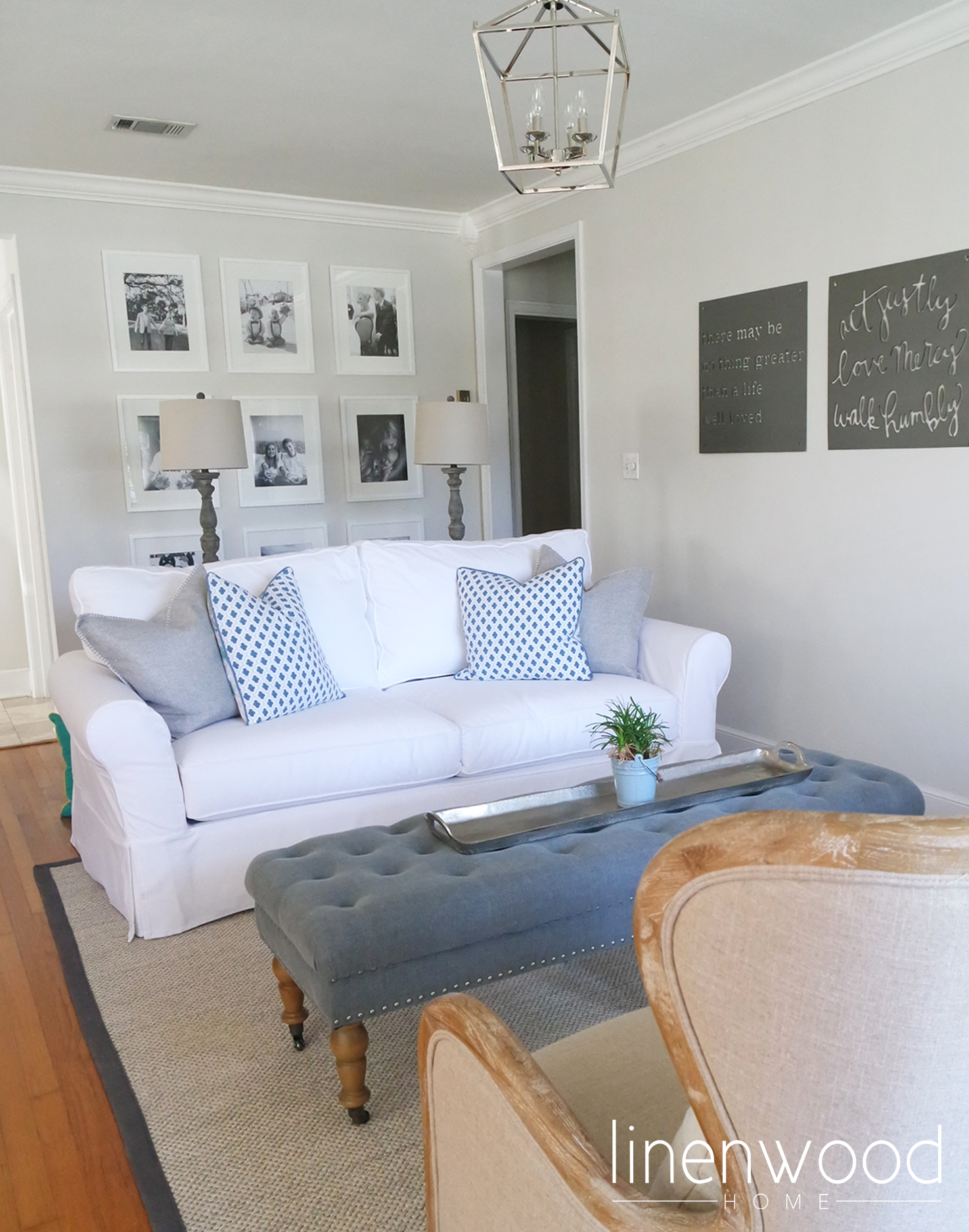
My client knew that she wanted a white sofa. As I have said before, I know a white sofa can be scary, but it can also be bleached and washed!!! To me, that's a mother's dream! And look how much it brightens up the space. It's not a huge space, so using light colored furnishings makes it feel open and fresh.
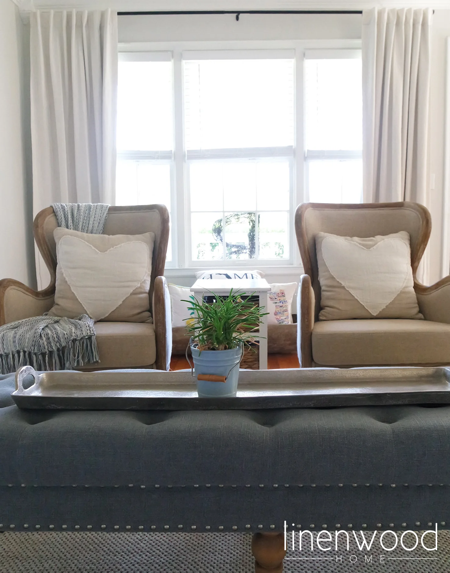
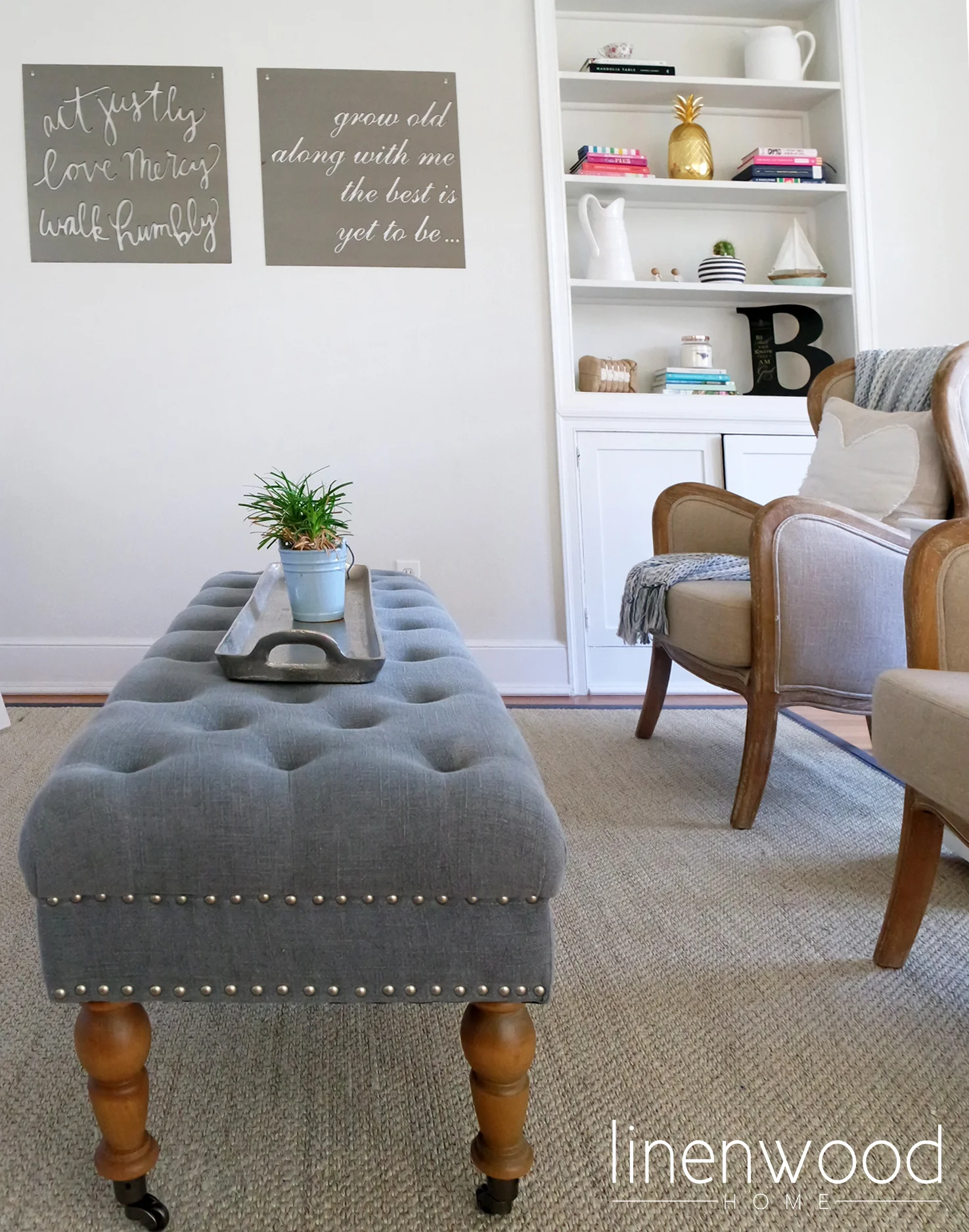
These chars were not our original choice, but sometimes I love how things work out. I just love them, as I think they provide a touch of rustic elegance. They dress up the space but not too much, and they are very comfortable.
The blue bench/ottoman was actually supposed to go in another room design, but it just worked perfectly here. I topped it with a long hammered silver tray, so it's great for placing drinks on when entertaining guests.
This part of their home has 8 foot ceilings, so we needed a smaller scaled light fixture, and I really wanted to stay away from a flush mount. This polished nickel lantern chandelier is perfect as it it open and doesn't weigh down the ceiling.
These metal signs are from Magnolia Market, and my client already had two of them that she wanted to incorporate. We found one more to make a trio of quotes that really fit both the large wall space and this family very well.
To complete the layered look of this living room, we decided to do a floor to ceiling gallery wall. You just can't go wrong with simple white frames and black and white family photos. It is always a beautiful way to showcase memories and tell your family's story.
I will be forever grateful to this family for trusting me with the design of their living space. But we aren't done yet, I can't wait to show you their great room we designed - that's up next!
Have a wonderful week friends!!


